Pages

Tuesday, October 19, 2010

Art Date

Our customers visit us under all kinds of circumstances - before the movies, after dinner, or when they come to show out-of-town friends our eclectic neighborhood and shops.

One local couple recently visited us on their anniversary, as they add one piece to their collection every year as an anniversary present. Read their story below:

Our Anniversary Art Tradition


We have friends whose house is filled with interesting and charming artwork, accrued through the years. How did they do it? Each year their anniversary present to each other is to choose a piece of art. Ten years after moving into our house, our walls still woefully barren, we decided to follow their lead and start a new tradition by picking out a piece of art together from 13FOREST. After a wonderful dinner at Flora, we went across the street to the gallery.


But how to decide? We probably didn’t have any artwork in our home because subconsciously we were both worried about the permanence of any art-buying decision. And now that we made a romantic event of art shopping we faced the extra challenge of making such a major choice after a good meal and a few glasses of wine, arm in arm with that special someone who might be saying she liked that print to be nice, or who might agree to buying that unique ceramic not to hurt her feelings. And then we’d be stuck with it forever.


Anticipating this problem, and with an eye to preserving future date-night encounters like this, we did what any couple in love would do if they knew what was good for them. Armed with pens and index cards, as soon we opened the doors we split to opposite ends of 13FOREST. We would each walk around the gallery, separately, and write down our top picks—no peeking, no cheating, be brutally honest: write down only what you can imagine on the walls. Then we’d see where there was overlap and decide among those pieces.


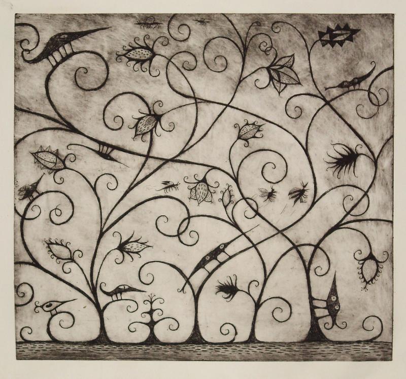
As we are apparently spiritually linked our lists overlapped to a great degree (and have every time we’ve done this). That first time we looked at our lists we quickly agreed on our first real piece of art, and being in a romantic mood, that it would be for our bedroom—a print by David Colombo of a kind of cartoonish spooky trellis with slightly creepy bug things with both eyes on the same sides of their heads. Now that’s art, we both knew.


Think of it as vow renewal via ink and oil.


-- Andrea Campbell and Allen Feinstein, Arlington


A fine choice: David Colombo's Flora and Fauna #2, etching, aquatint

Friday, July 16, 2010

artist talk roundup

Last night was all about encaustic when Taleen Batalian, Anne Cavanaugh, and Tracy Spadafora spoke about their work exhibited in Preserve. The event was well attended as the artists attracted past students, fans, friends, family, and general art appreciators.


Tracy Spadafora spoke about her current work incorporating DNA code - a new direction that evolved from past work using Big Dig blueprints. She spoke of her fascination with text as image - when strings of letters aren't read from left to right but absorbed as a pattern.


Taleen Batalian described her love for the conversation between medium and artist - the immediacy of heated wax, each layer demanding impulsive decisions.


Anne Cavanaugh compared her process to needlepoint, acknowledging an orderly personality, and describing herself hunched over a piece with a needle and magnifying glass laying poppy seeds down with care.


An audience member astutely pointed out that all three women started out as oil painters and later moved on to encaustic - whereas historically, encaustic was used only up until oil was discovered.

Encaustic attracts new fans, artists and art-appreciators alike, all the time. There's something seductive about its surface - the transparency, the depth. The way the medium almost speaks for itself, but lends itself to great manipulation.

Thursday, July 8, 2010

bravo's work of art - negating this male's gaze? no way

as some of you may have figured out, jimk is the intellectual in the family. that's why i'm always tickled when we sit down with dinner in our laps to a rollicking night of reality tv - i can hear the eye rolling from across the room.

dutifully though, the stereo goes off and the idiot box goes on. last night we were served bravo's "work of art" followed by "top chef: dc" - crits and quickfire challenges, the "gallery" and the judges' table - it's all basically the same and all kinda fun.

the artists, however, are quite unlike the clothing designers, drag divas or would-be pop stars. they're all a little bit too-cool-for-you and can barely work up a head of steam for the various challenges. watch them the next time they receive their assignments - you can practically see the crew poking them with cattle prods to force them to show the slightest bit of enthusiasm. perky they ain't.

jimk: "the winner is someone who's pleased the greatest number of people the most times - is that really any way for an artist to work?" well, no...but if you're going to be an artist, don't you sometimes have to be concerned with what else is out there? not to mention what's been done before? artists are constantly competing for wall space, buyers, prizes. from our end, curating is the name of the game.

what makes the show fun, i think, is that not everyone who thinks they're good at this stuff actually is. from the judges to the judged, it's really up to the guy with the remote contol to decide.

anyway, enough of that - i gotta run. bethenny is getting married!?

Friday, June 11, 2010

artist talk

Strata comes down tomorrow! For one last tribute to the printmakers, here are some pictures from the Third Thursday artist talk on May 20.


Here's Ellen Shattuck Pierce speaking about her linoleum prints. She exhibited two series in the show, her "puzzle" series along with the "kitchen follies" series. While the kitchen follies cheekily depicts violence in the kitchen, the puzzle series is a more subtle contemplation on collage.

Susan Jaworski-Stranc brought visual aids to describe her process of reduction linoleum printing:
Each sheet shows a step in the reductive process as the colors and image complexity accrue.

And here she is explaining it as Ellen Shattuck Pierce and Marc Cote, fellow Strata exhibitors, and Marco Athie, another 13FOREST artist, listen attentively.

Thanks to all who spoke and listened.

Saturday, May 8, 2010

Printmaking processes

Since we opened Strata, a show featuring four printmakers using four different printmaking methods, we've gotten a lot of questions as to the different processes the artists use. So here we go, a brief introduction to the printmaking processes featured in Strata:

Linoleum printmaking - surprise! - starts out with a sheet of linoleum. The artist draws or transfers an image onto the sheet, and then uses a carving tool to scoop away the negative space in the image. That leaves a surface resembling a stamp, with a raised image. Then the artist applies ink to the raised surface of the block using a brayer (hand roller). The inked linoleum is then pressed on to a sheet of paper through a press or by hand with a rolling pin - or anything else that gets the job done.

To create multiple layers of color and add detail to an image, one can create multiple linoleum sheets to press onto the paper in a specific order according to color and shape.

above: Cold Shoulder, Ellen Shattuck Pierce, linoleum print, 24" x 30"

This is the method that Ellen Shattuck Pierce uses. In her "puzzle series," she creates different linoleum puzzle pieces that she'll combine onto one sheet, and then print.

Reduction linoleum printing - Susan Jaworski-Stranc's technique - uses just one sheet of linoleum to create all the different layers. This is also referred to as "suicide printing" because with each layer, you carve more of the block away - so once a layer has been printed and you start carving for the next layer, there's no going back.

above: Coastal Forces at Sunset, Susan Jaworski-Stranc, reduction linoleum print, 9" x 12"

Anne Silber creates serigraphs - a process also known as silkscreening or screen printing. You apply ink on top of a mesh screen and use a squeegee/hand-roller to press the ink through the mesh onto the paper. To define the image, you create a stencil that is placed on top of the mesh, so that the ink only marks the page in the negative space of the stencil. Once the ink dries, you create more stencils to make multiple layers of color and add complexity to the image.

above: Ha Long Bay, Vietnam, Anne Silber, serigraph, 18" x 21½"

Marc Cote's pieces are woodcuts, which is the same process as linoleum printing, except with a block of wood. Two of Cote's prints in Strata are monotypes, meaning that he only made one print of each image. The other prints in the show are limited editions - the artists made a set of each image, and each individual print is labeled within the set, say "1/25" or "7/50". This helps keep the price down (compared to one-offs) as the artist's time and labor is distributed amongst the set.
above: Colossus, Marc Cote, woodcut, 11 1/4" x 14 1/2"

Tuesday, April 13, 2010

San Juan, Part 1: National Expression in the 20th Century

The people of Puerto Rico know their history and culture, and have justifiable pride in both. A longtime colony of Spain and then of the United States, the island is now the latter's “unincorporated territory.” Having a constitution and the right to elect their own governor and local officials, Puerto Ricans are still subject to American law but paradoxically ineligible to vote in U.S. federal elections unless they move to one of the fifty states. Given this somewhat confusing status, during a recent trip to Puerto Rico Marc and I were not surprised to read local newspaper debates on whether the island should maintain the political status quo, petition to become the 51st U.S. state, or seek full independence. Central to the debate is nothing less than the island's long-developing sense of self.

Expressions of Puerto Rican culture are found everywhere across the capital city of San Juan. Walking through its streets, you will see many people with the national flag prominently inked into their skin, and hear music influenced by 400 years of interaction between the island and Spain, Africa, Latin America and North America. Rhythm-driven and highly expressive music forms such as bomba, plena, and reggaeton emanate from neighborhoods near San Juan’s ancient city wall (above) and from clubs around the corner from the Museo Pablo Casals (Pablo Casals Museum). Itself a national treasure, the museum contains a trove of the cellist’s manuscripts, recordings and photographs of performances at San Juan's annual Casals Festival, one of the world’s oldest and most prestigious classical-music events.

Around the corner from the museum is the Galeria Nacional (National Gallery) of Puerto Rico. Sun drenched atop the oldest part of San Juan, it was built in the 16th century to serve as a Dominican convent. Off its central courtyard are four rooms in which art from Puerto Rico’s original colonization to the 20th century is thematically hung. The collection is solid throughout and might leave you wondering how popularly accepted canons of great paintings could possibly exclude the work of so many of its artists. Of particular interest to me were paintings in the museum’s third and fourth galleries. Produced mostly after Spanish colonialism was swapped out for American colonialism in 1898, they document an evolution in Puerto Rican cultural and political identity.

Costumbrista (traditionalist) painting developed in Puerto Rico during the first half of the 20th century when colonial transition threatened longstanding traditions and social order. Typically works of this type depict the everyday manners and customs of people who lived across the island. Ramón Frade (1875-1954) became one of the most famous of the costumbrista by sincerely elevating countryside laborers into symbols of Puerto Rican self-reliance and patriotism. In his 1905 painting titled El Pan Nuestro de Cada Dia (Our Daily Bread) an elderly farmer walks barefoot and upright while carrying a heavy load of freshly cut plantains. Nearly life size, the painting is considered one of Frade’s best works and one with which Puerto Ricans would identify through approaching decades of poverty and upheaval. Other notable costumbrista included Oscar Colón, Juan Rosado and Rafael Ríos, the last of whom gained fame as a muralist.

In the middle of the 20th century, Puerto Rico’s economic base began a radical transition from rural agriculture to urban manufacturing and service. With it a great population shift occurred and the island’s artists turned their gaze to new socio-economic concerns. Loosely consolidated under the title of generación del cincuenta (the fifties generation) many of these artists worked for the Instituto de Cultura Puertorriqueña (Institute of Puerto Rican Culture), a government agency established in the 1950s to develop policies to enrich and preserve the cultural values of Puerto Rico. Despite the conservative ring of the institute’s mission, its artists often depicted urban life through harshly realistic eyes.

One of the most recognizable names of the period was that of Rafael Tufiño (1922-2008), who was born in Brooklyn to Puerto Rican parents and then moved to the island at the age of 10. In the National Gallery hangs Goyita (above), a 1953 portrait of Tufiño’s mother that, with its determined but weary gaze, introduced psychological complexity to Puerto Rican portraiture. The national sense of self was still strong, but here it is shown with the correlating fatigue of the time. Urban landscapes took on a similar psychological edge, particularly in works depicting streets and their inhabitants in tangles of movement and the accoutrements of modernity. Among Tufiño’s peers were artists Lorenzo Homar, Julio Rosado del Valle and José Antonio Torres Martinó.

I left the National Gallery pleased by what I had seen and learned. But my mind kept returning to a few objects that at first I thought had been discordant with each other. They were a mid-century oil painting calling for war against colonialism, and a dozen primitively carved wooden santos (saints) silently standing in a display case. In what way were they complementary aspects of 20th-century Puerto Rico?

[to be continued]

Tuesday, March 9, 2010

nyc art fair roundup

Going to the Armory Show (not to be confused with going back in time) is like walking through the ads in ArtForum. The place is packed with the highest of the high end galleries from New York, London, Berlin, etc. Some stuff was good and some stuff was weird, but much like ads, everything had to compete to break through the clutter before your eyes.


Marc and I spent Thursday and Friday scoping out "armory week" around the city. We went to the Armory Show, VoltaNY, Scope, Red Dot, and Verge. This way we saw a range of exhibition spaces, from hotel rooms (bathroom art! art in sock drawers!) to a booth showing only one painting.


VoltaNY and Scope are great antidotes to the exhausting competition of the Armory. They attract similar crowds, though - combination of the museum-going-public with real deal collectors. They show some edgier high end stuff, fostering more of a fun-vibe than an impress-you-to-pieces vibe. But this still isn't art buying for amateurs - everyone is in the business of art stardom.


Red Dot was pretty sleepy early Thursday afternoon. Seemed like the gallerists exhibiting there made a last minute decision to jump on the armory boat, figuring that being anywhere in NY would present opportunities that don't exist in their home cities (including Boston). That's got to be the idea that fuels a lot of these small offshoot fairs. At Verge, each gallery set up in a hotel room. There was a lot of Brooklyn art, and I was often distracted by the creativity in space-usage.

New York is always packed with art. During Armory week, it's packed with even more. Experiencing the range - from $95k paintings at the Armory, to $10, 2" x 2" drawings in a cramped hotel room - is the best way to take an accurate snapshot of the art world. Big events like this offer art lovers who frequent museums, but shy away from galleries, to cross over into the commercial world. I hope people don't get scared off by the high end atmosphere and price tags though, because the art world extends far beyond that.